T Ashok @ Ash_Thiru on Twitter
Summary
Why does a complex UI faze a tester? Is it possibly the inability to see beyond the UI, the inability to question beyond the obvious? Too many test cases, the overwhelming feeling that scientific modelling & design cannot be practised due to time constraints are some of the issues. This article outlines “How to decompose, question & analyse” to design smartly using a complex UI entity as an example.
During a recent consulting engagement, I noticed that a tester came up with a complicated decision table to represent the behavior model. On closer examination I noticed that he had arrived at behavioural conditions by examining the complex UI visually, rather than digging deeper to understand the behaviour. This is not the first time I have seen this, I have observed the challenge with behaviour modelling many times in numerous companies.
So “why does a complex UI faze a tester?” It is possibly the inability to see beyond the UI, the inability to question beyond the obvious. The result – too many test cases, and the overwhelming feeling that scientific modelling & design cannot be practised due to time constraints. Well this is the fun part of testing ‘the intellectual one’, where one decomposes an entity through a process of rational analysis and utter curiosity by thinking better to test smarter.
A rich UI typically has large number of data fields, some dependent on others or system settings, possibly in multiple tabbed dialogs, and doing the same thing in different screens i.e. a feature available in multiple places. This seems to pose difficulty in (1) “where-to-start” to model the behaviour (2) mixing test cases related to fields, UI and behaviour, business flow & environment dependencies.
Let us look a problem to see how we simplify testing of a rich UI using an airline application, done in four screens, each of one which seems complex.
(From http://awery.net/pages/software.html#page-screenshots)
1.Setting up a flight schedule for a flight
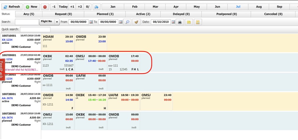
2. Setting the route information -“start location details”
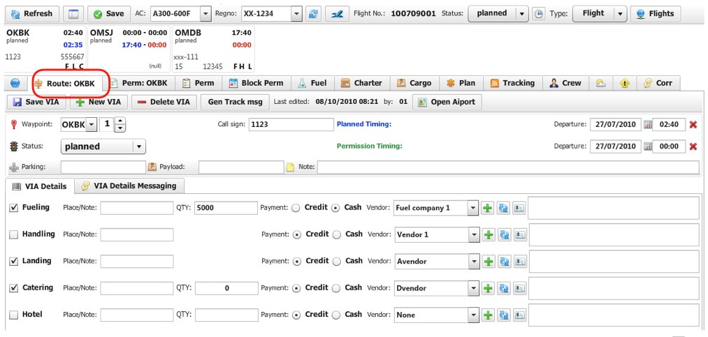
3. Setting up the route information – “permissions”
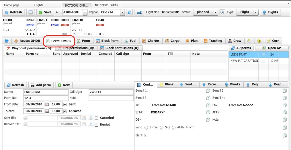
3. Setting up the route information – “cargo details”
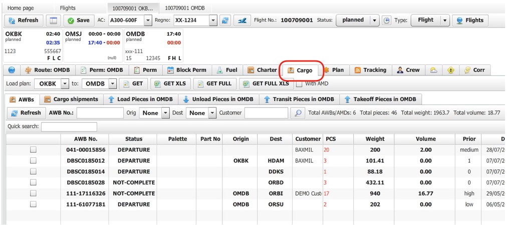
4. Setting up the route information – “setting up crew”
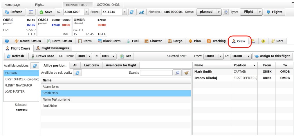
What do we see in the rich UI?
Let us analyse…
1. Firstly we can see data fields – independent and dependant one.
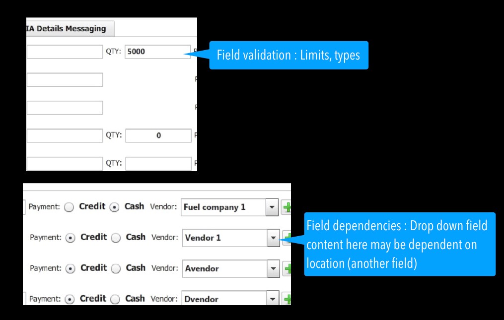
2. Secondly we see feature/function (some of them a mini feature) and a business flow that is really a combination of many features.
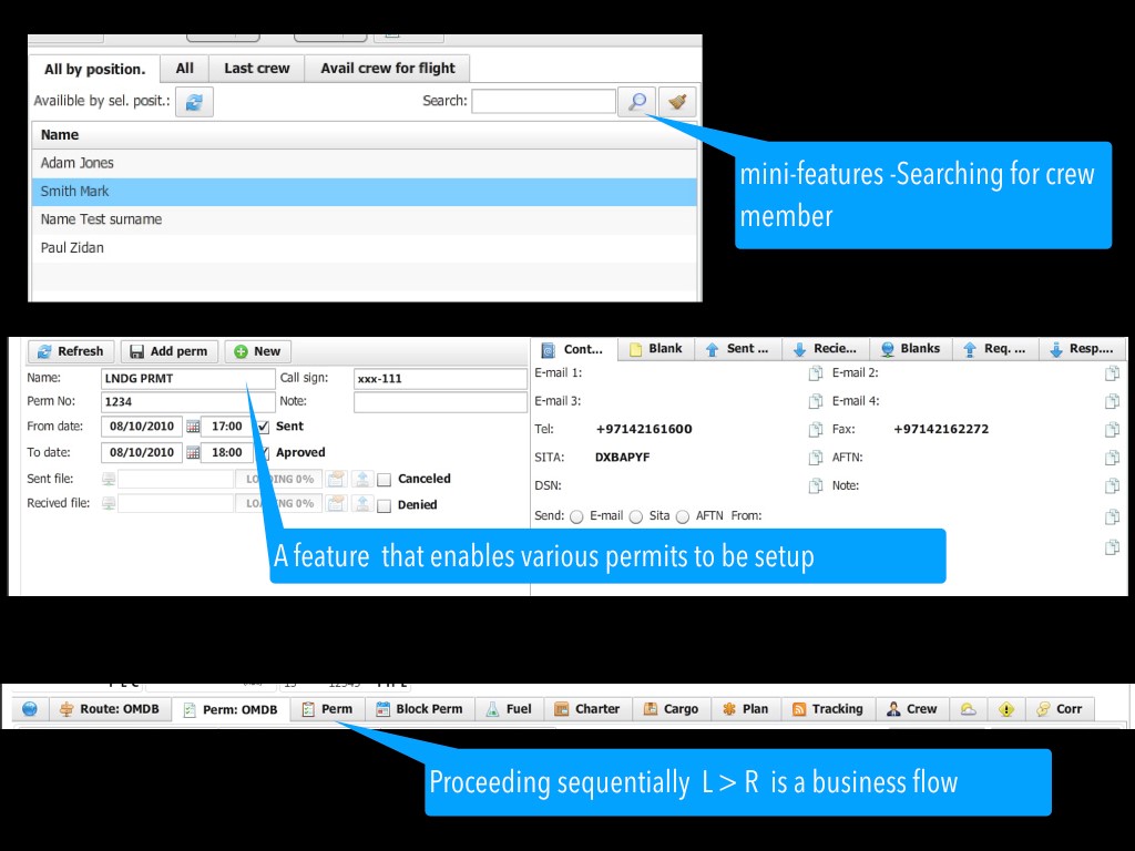
So, this single rich UI screen consists of a set of features, and enables a complex flow to be done. How do we test this?
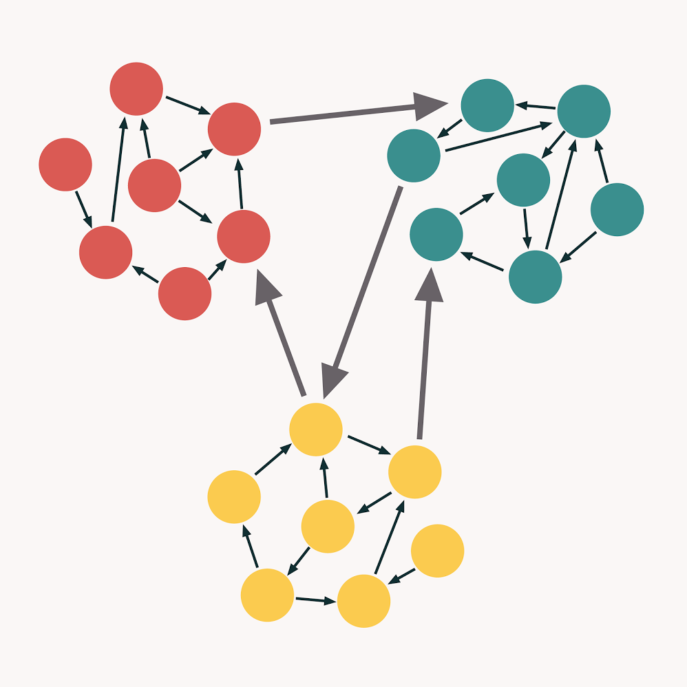
Let us look at good design principles “COHESION & COUPLING “. Good design of software is high cohesion and loose coupling. Grouping similar actions & data (cohesion) keeping minimal dependencies between them (coupling).
How is this useful in TEST DESIGN for rich UI?
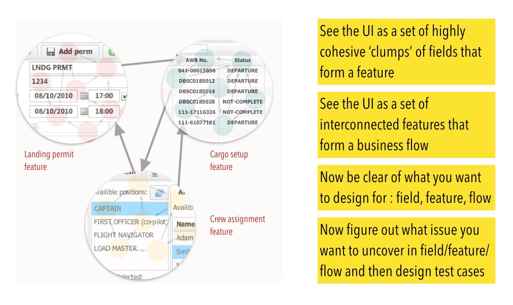
Let us dig in…
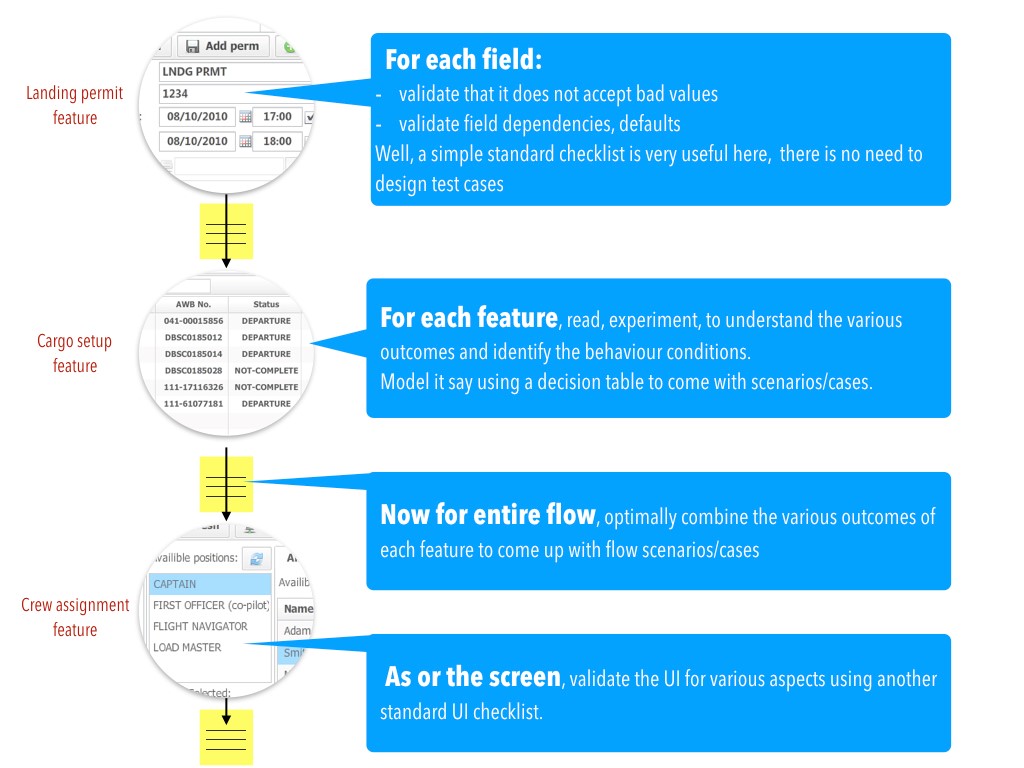
So, what have we done to tackle challenges of complex UI?
Well, we have:
1. DECOUPLED complex UI into COHESIVE entities : FIELD, FEATURE, FLOW & UI
2. Applied behavior driven approach for feature test design (decision table)
3. Combined outputs (variations) optimally to test the FLOW (variations table)
4. Used checklist as needed to leverage prior design
In a rich UI, one tends to see HOW-to-do, whereas if it was UI-less, one seems to focus on “WHAT-is-to-be-done.
T Ashok
The latter is important for a tester to figure out ‘WHAT-ifs’.
Signup to receive SmartQA digest that has something interesting weekly to becoming smarter in QA and delivering great products.

Comments are closed for this article!